Step into the refreshing world of Wellness Week through the designs I’ve passionately crafted. Immersing in soothing shades of green, blue, and pink, each visual element celebrates well-being, vitality, and connection with nature.
Elevators of Well-Being 🌿🏞️
The specially designed elevators for the event are more than just a means of transportation. They are an invitation to a sensory experience. The calming colors of green, blue, and pink create an atmosphere that relaxes the mind and uplifts the soul with each ascent.
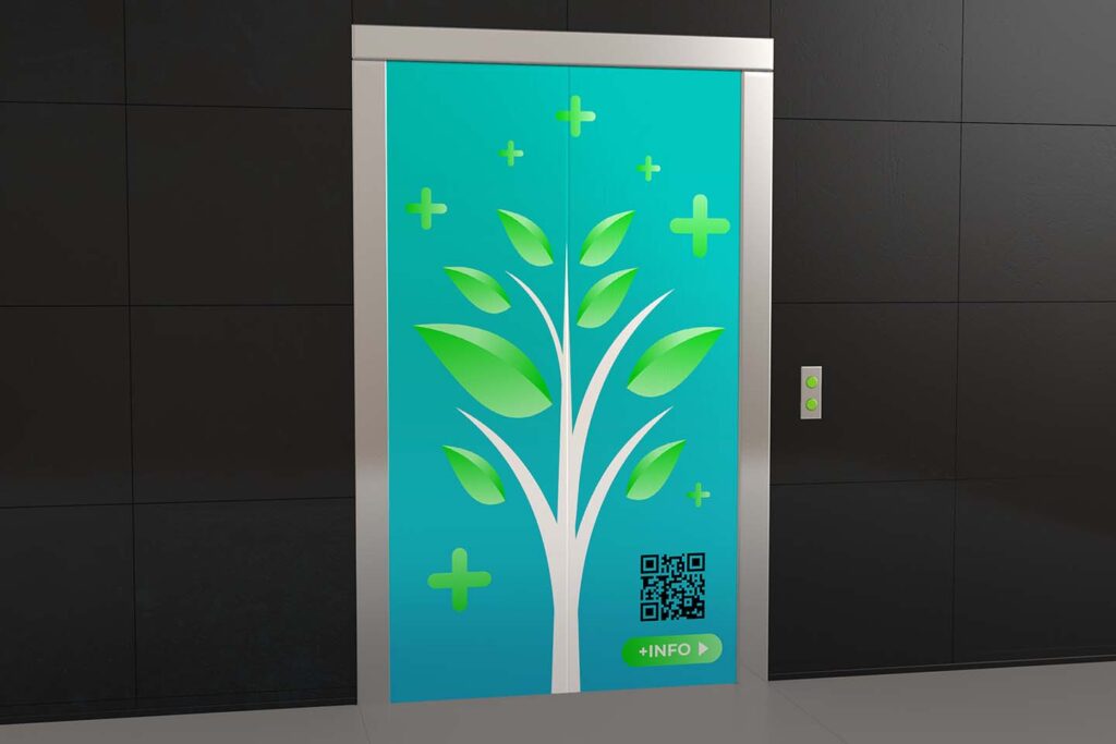
Charm of Nature 🌳🌸
The first design featuring the simple and elegant tree is a celebration of nature. The tree symbolizes growth, vitality, and stability. The shades of green and blue add a touch of calmness and balance, inviting participants to connect with their natural essence.
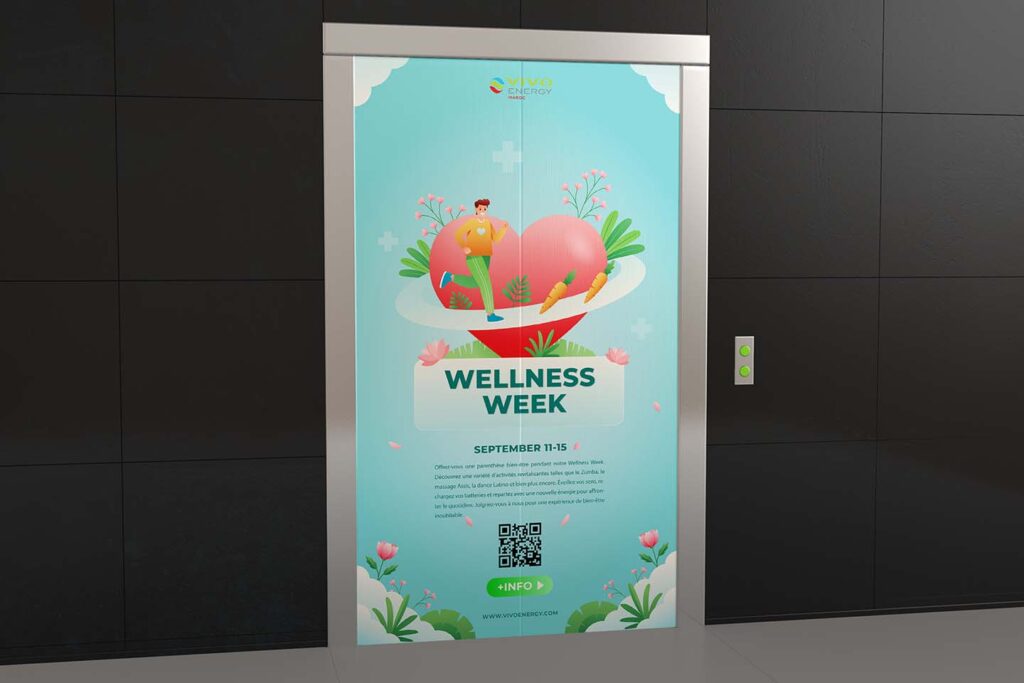
Fusion of Natural Elements 🌺🏃
The second design is an explosion of life and movement. The illustrations, herbs, and flowers evoke the freshness of nature. The running person symbolizes physical activity and energy. The carrots add a playful and healthy touch, celebrating vitality and balanced nutrition.
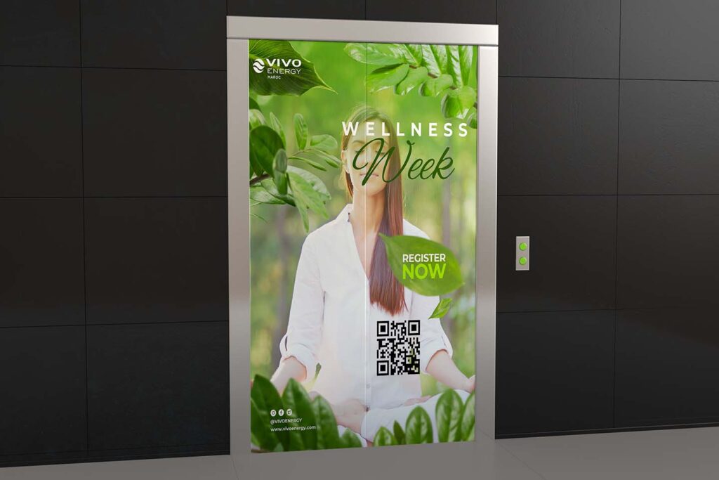
Blossoming and Harmony 🌿🧘
The third design offers a unique perspective on well-being. Focusing solely on green creates an atmosphere of inner peace and self-connection. A meditating woman becomes the focal point, inviting balance and reflection.
Colors for the Soul 🎨🌈
The choice of green, blue, and pink as the main colors is not arbitrary. Green evokes growth, healing, and harmony. Blue brings a sense of tranquility and mental clarity. Pink is a gentle color that recalls self-love and emotional well-being.
Awakening of the Senses 🌞🌿
These designs are not merely visuals but invitations to the awakening of the senses. Each color, illustration, and visual element has been chosen to create an experience that nurtures the body, mind, and soul.”